SocialScope
Data viz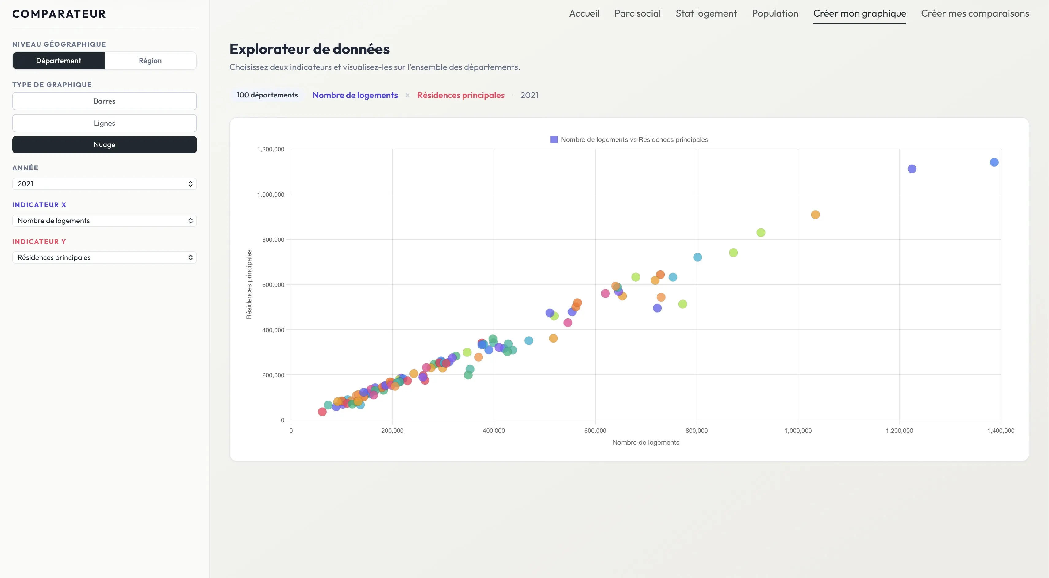
Description
SocialScope was a data visualization assignment focused on data exploitation rather than just its formatting. Generally, the entire site is based on crossing social, territorial and demographic indicators to highlight useful readings on housing, social housing, precariousness or population. The last two pages push this logic further. The Creation page allows you to choose several types of readable graphs, such as scatter plots, lines or bars, then cross two indicators on the X and Y axes to quickly test a hypothesis. You can read the data at the regional level, with fewer points and smoothed values, or at the departmental level, with much more detail and a hover that accurately identifies each territory. This overview serves to bring out correlations and outliers. The Comparator page then acts as an analysis magnifying glass: you can isolate one or two departments from the interactive map or the sidebar, then instantly obtain a series of detailed graphs to put unemployment, precariousness, density or the distribution between individual and collective housing into context. The most important point in this project was therefore not only to produce beautiful graphs, but above all to choose the right data crossings, to understand what they allow to deduce, then to verify these hypotheses clearly and immediately.